How Design Can Create Your New Product Category
Working Back From the Future
A client recently asked the Product Creation Studio UX and Industrial Design team to explore what an urban city commuter bike could look like in the not so distant future. The outcome was an exploration of features related to user needs, context of use and environmental impact.
From Wild Idea to Product Hit
One technique the Design team employs across projects and clients, is a thought-exercise brainstorm that pushes the use-case to be more extreme, suspending the limits of technology.
To begin, the project team asked the client to forget everything they knew about how bicycles were used; the experience is what mattered. The feel of the great outdoors, the excitement of a two wheeled object, and the sense of a thrilling adventure are what create the ultimate cycling experience.
After thorough research of what we thought an electric urban bike market would look like, we decided to question the category as a whole. Is there opportunity in this segment, or are we missing a much larger opportunity?
This is when we shifted from the saturated category of the electric urban bikers, and started to look at the Weekend Warrior and what their needs were.
Using a UX tool called AEIOU Framework, we took a deep dive into the desired market to look at their associated Activities, Environments, Interactions, Objects and Users. After exploring where we thought the bike market was heading, we began to see the possibility of a new category emerging.
Target Identified: Weekend Warrior + Backcountry Camping
The backcountry is not just a place where only hiking exists, it is also popular among cyclists. By discovering this new combination of user + activity, we set out to redefine how far you could travel, what you could see, and the amount of effort that it would take to get away from the city.
We are passionate about projects like this, and decided to take a stab at what we thought this new product category could look like. We wanted to redefine how the Weekend Warrior lived their adventurous weekends. There was no way to access backcountry adventures on two wheels in the amount of time that our defined user, the Weekend Warrior, had.
"There was no way to access what we wanted to access in the amount of time that our defined user, the weekend warrior, had. "
The result was a new product category: purpose-built, packing bike. Currently, there is no electric bike that is purpose-built for bike packing.
As a design team, we follow a tried-and-true process that has been successful for countless projects. We started the project with much research and further defined the problem. Iterating quickly, we went through numerous ideas on which direction we thought the project would go.
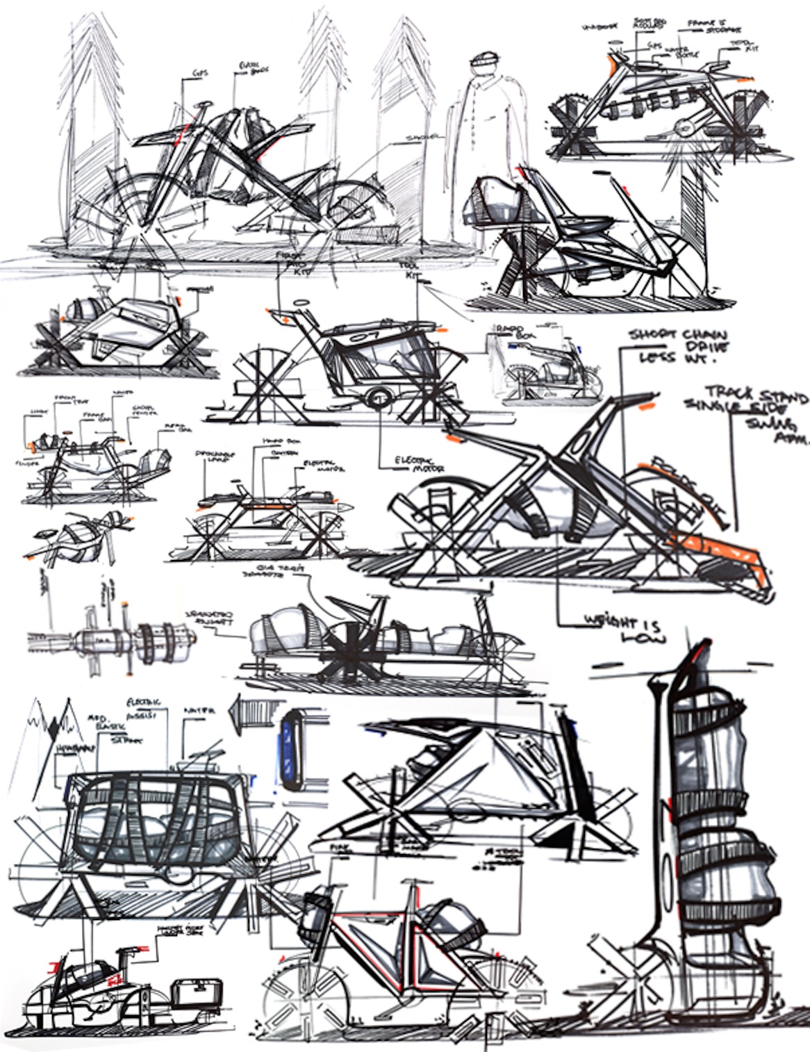
Sketching was a valuable type of exploration in the project. Each of our designers moved through several ideas in search of what the next backcountry bike could look like.
At the start of the sketching phase, we explored architectures of how the cycle could be used. It is extremely helpful to have multiple designers working on the same project because of the diversity in perspective of the issue. As designers, we like to push and pull to see how mild to wild you want your product to be. Each designer's idea is an opportunity to open new doors for the others.
Ambiguity is what we thrive on. We love the opportunity to explore and the possibility of creating something fantastic. During exploration, no ideas are bad ideas. We love to sketch on paper at the start of this stage, and then move to a digital, more refined form.
"Ambiguity is what we thrive on. We love the opportunity to explore and the possibility of creating something fantastic. During exploration, no ideas are bad ideas."
Constructive critiques pushed us in new directions. Questions like "why did you place the bags here?", or "how do you imagine this part working with the bike's construction?" were asked throughout the exploration stage in search for validation. A focus of the project was on functional usability, and as a bicycle, that meant truly thinking about how it would be used, ridden and abused.
Rough thumbnail sketches moved to tighter more refined sketches, and this is when we really began to see the impact that design had on the project. The exploration of concepts, mixed with effective ideas that could one day be a physical object. Reviews didn't stop at this point, and each concept kept improving.
Establishing the Innovation Envelope
A thought exercise our design team uses to generate a wide range of ideas is to apply tomorrow's possibilities to today's problem. The design team applied the needs and workflows of the bike-packer to multiple future scenarios. The Weekend Warrior in 2020 may be different than the Weekend Warrior in 2040.
We took our chosen designs and tightened them up into ideas that we think could work tomorrow, or twenty years into the future.
Check out the different concepts we created for our target market:
Polarity Concept
WILD IDEA: This future-forward concept focused on creating a bike-packing bike that might be made in the next 20 years.
The suspension of the bike is mag-lev, creating a unique aesthetic and ride feel. A thin red light runs the side of the frame from the pedal motor to the rear wheel motor, and then across the whole frame to the front motor - visually telling the story of the electric drive. The 2wd system functions as a pedal by wire system, and charges on the fly. Power travels through the frame in micro carbon nano-tubes with minimal loss of charge, and the nano tubes are also used to house energy harvested from braking. The frame is continuous into the fenders that deflect debris from a unique incident angle.
Polarity Concept features three electric motors housed in the crank housing, front and rear hubs. The wheels cut weight with the help of carbon rods creating structure and simplicity. Under the top section of the carbon fiber frame, a soft touch texture was added to aid the user in carry the bike over hard-to-ride obstacles. A tool kit was added for the situations that seem to be inevitable. GPS is integrated for exploring new trails, and solar panels line the inside of the tool kit housing ready to charge whenever turned to the sun.
To bring our concept back to earth a bit, a bent plywood storage rack was fitted as a nod to classic style, employing hi-tech material engineering to make it durable. Research showed that backcountry users all have their own gear, unique to their workflows. Because of this, modularity was key in the Polarity Concept to allow the user to set up their gear as they please.
Go Further Concept
MILD IDEA: The Go Further concept focused on creating a bike-packing bike that could be made in the next 10 years.
To bring us closer to a sellable product, this concept mixed both conceptual and realistic ideas. It has a frame that is continuous and never broken for rigidity, and efficient electronics packaging. A single Ohlins shock beneath the seat replaces a heavier and more complicated rear wheel suspension.
The most important part of backcountry bike packing is the storage of luggage which is supported by large carbon fiber trays with slots cut of the sides for easy attachment of straps and little added weight. Head and tail lamps were integrated for safety and usability, while a skid plate was added for protection of the vital drive components.
An electric motor provides assist to the rider-customizable chain and sprocket combo that requires only minimal maintenance. The battery does not only power the motor, but the lights and GPS, and is removable for simple charging access.
The Go Further Bike: The Product Design
FINAL CONCEPT: This is the Go Further Bike concept, designed for the Weekend Warrior. This bike is a purpose-built, packing bike that can be manufactured today.
The design language speaks to the bike's capability on the trail, as well as it's integrated technology. On the side of the frame, green luminescent strips are inspired by the futuristic Polarity Concept and provide safety. The electric pedal assist motor is integrated in the GPS and AI system, the bike automatically adjusts its level of assistance according to the length of the journey and it's terrain. Over time, the Go Further Bike learns its rider's speed preferences and quietly, invisibly adds assist when needed.
The frame is lightweight carbon-kevlar mix to keep cost down, and has a tube-shaped top for carrying on the shoulder over impassable obstacles. It has a lightweight, single-sided swing arm supported by a single mono-shock to reduce weight. Small bags are fitted to the front fork to keep the center of gravity low. The quick-release rear parcel tray stows away into the frame for better center of gravity and manuverability when riding without luggage. The bike incorporates front and rear fenders to keep the bike clean, but the rear fender also doubles as a trowel for use in activities... away from the campsite.
When to Let Designers Go Wild, or Have Them Evolve Your Current Offering
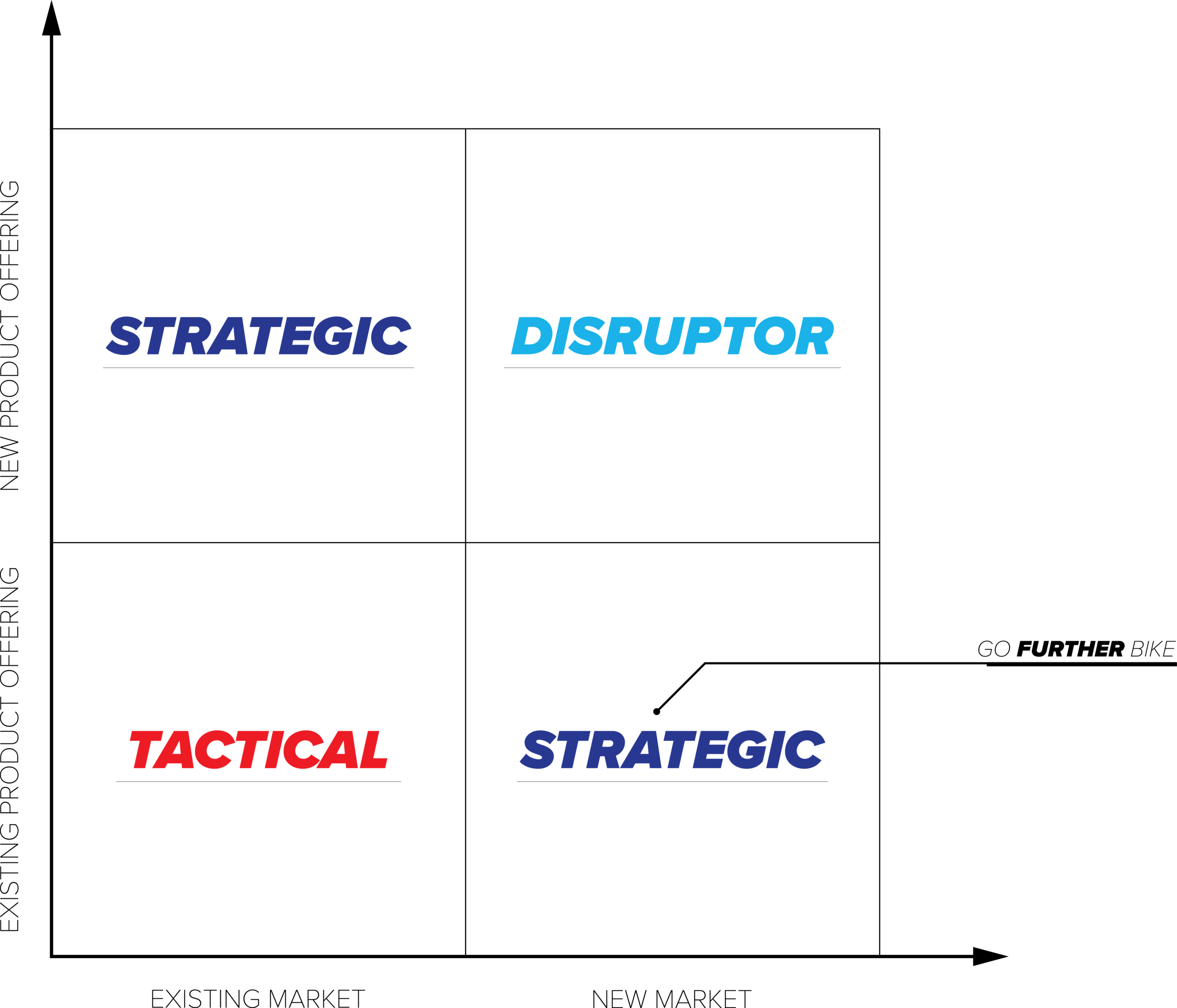
Our UX and Industrial Design teams often work with client-side marketing leads and product manager leads to consider the business case, demographic and product life cycle. We advised our client that going a little off-brief in the product development path this early on wouldn't be too risky. While going a little 'wild' during the 'Go Further Bike' project, the Design team saw an opportunity to take an existing product offering (electric commuter bikes) and design it for a new market: Weekend Warriors interested in backcountry camping.
When the 'aha!' moment came, we knew it was time to reign the team back in and focus on a manufacture-able product offering.
We worked with the client to create an Ansoff Matrix evaluation to identify the right product development path.
Making a new product is a journey that we take together with our clients, and we check-in at every major decision point. Together, we brainstormed the bike's product development risks, and the risk of entering a new market.
Ultimately, it was decided that the Go Further Bike was the right product to develop for our client.
Design is a powerful tool, and even more effective with the use of a defined process. Here are some take-aways from from the G0 Further Bike Project:
Don't lock down the project/product idea too early.
While it may be uncomfortable, let UX and ID teams take a deeper dive into your idea and even question the use-case.
Let ID go 'wild' within a certain set of the constraints.
Consider using ID as a tool to explore your innovation envelope.
Let ID help you with your product strategy early on, before features and demographics are locked down.


